The Boutique Design New York trade show, better known as BDNY, is the culmination of design for the calendar year. Taking place in New York City, the cultural capital of the world, in mid-November. This show brings together boutique hospitality brands, designers, and trend influencers, together with innovative products and world class manufacturers to push design boundaries and open new opportunities in the hospitality space. This exhibition is truly a must see to understand what is trending in the space of color, materials, and finishes.
Our design team left BDNY feeling recharged and inspired, ready to meet the new year of 2024 with fresh, new ideas! Keep an eye out for our 2024 Trend Forecast early in 2024. This will give you insight into what is influencing our 2024 direction for product and color stories!
COLOR TRENDS
Watching color and seeing how color shifts is probably the biggest indicator of design movement in the hospitality environment and it is certainly the most fun! There was no lack of color at this year’s BDNY show. Beautiful jewel tones made an appearance as accents on walls, floors, and in furniture elements. These colors were rich and vibrant with a nod to high end luxury. Opulent forest greens, navy blues, and shades of burgundy were anchored by burnished golds and hues of aubergine.
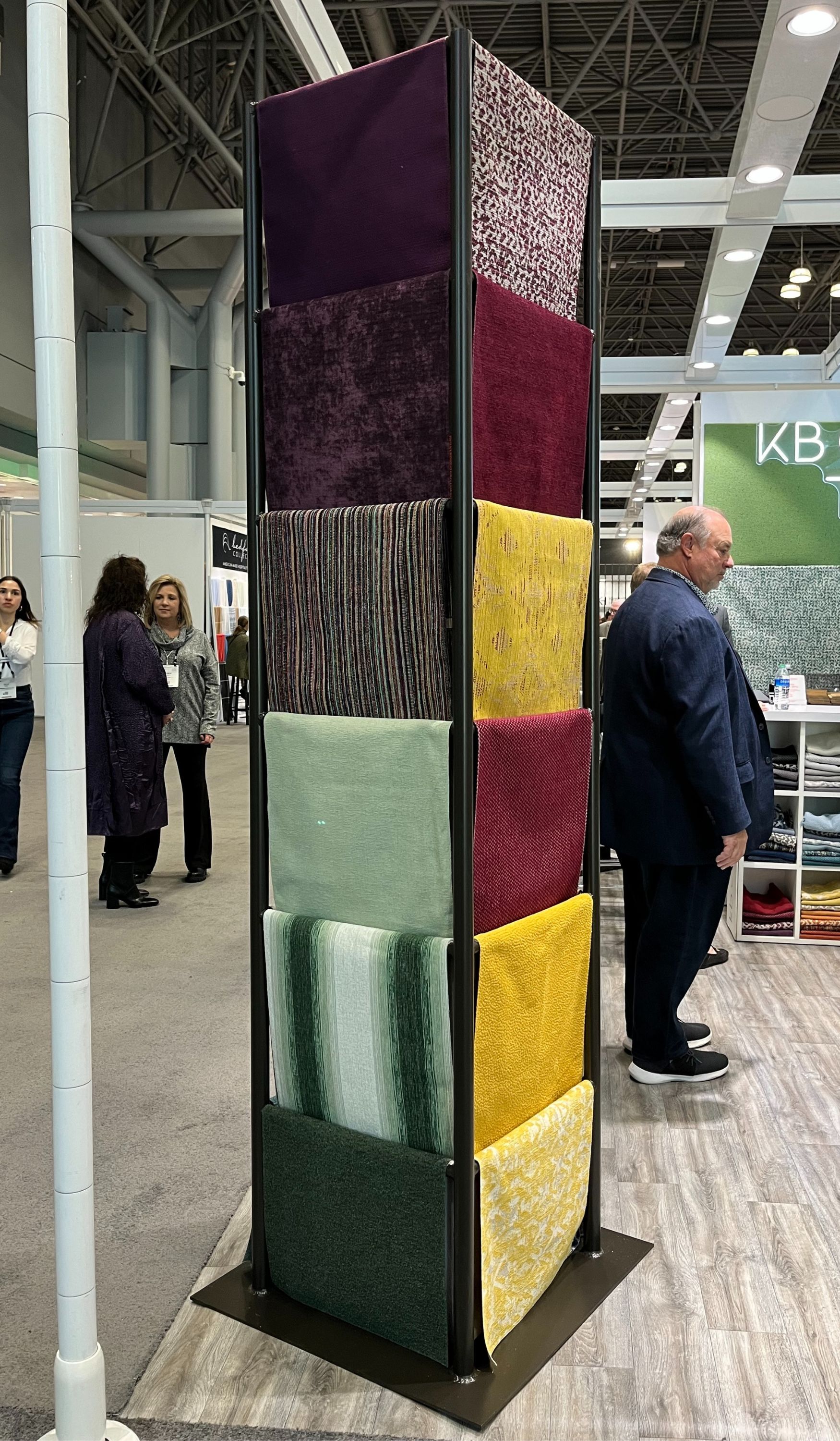
Deep wood tones in browns with a hint of red undertones added additional drama to many interior schemes on display. The richness of these colors was balanced out by neutral shades of taupe and mushroom. There was also a resurgence of basic black, which never goes out of style.
On the opposite side of the color spectrum, we saw pastel neutrals that gave spaces a light and ethereal look. Soft shades of celadon green, buttery yellow, and sherbet orange were balanced with warm wood tones and tinted whites to create a calming environment.
Red tones were certainly having a moment at the show this year. From warm orange and russets to classic red wine and plum tones, this palette was everywhere. We also saw bright lipstick reds moving into soft pinks and some pops of magenta that added a bit of whimsey.
The neutrals are the grounding elements that help to carry the color in the interior. We witnessed a shift here, too. Neutrals were well balanced between cool and warm tones providing the perfect palette backdrop. There was light, creamy, whites with warm undertones along with taupe and mushroom hues that added balance.
MATERIAL
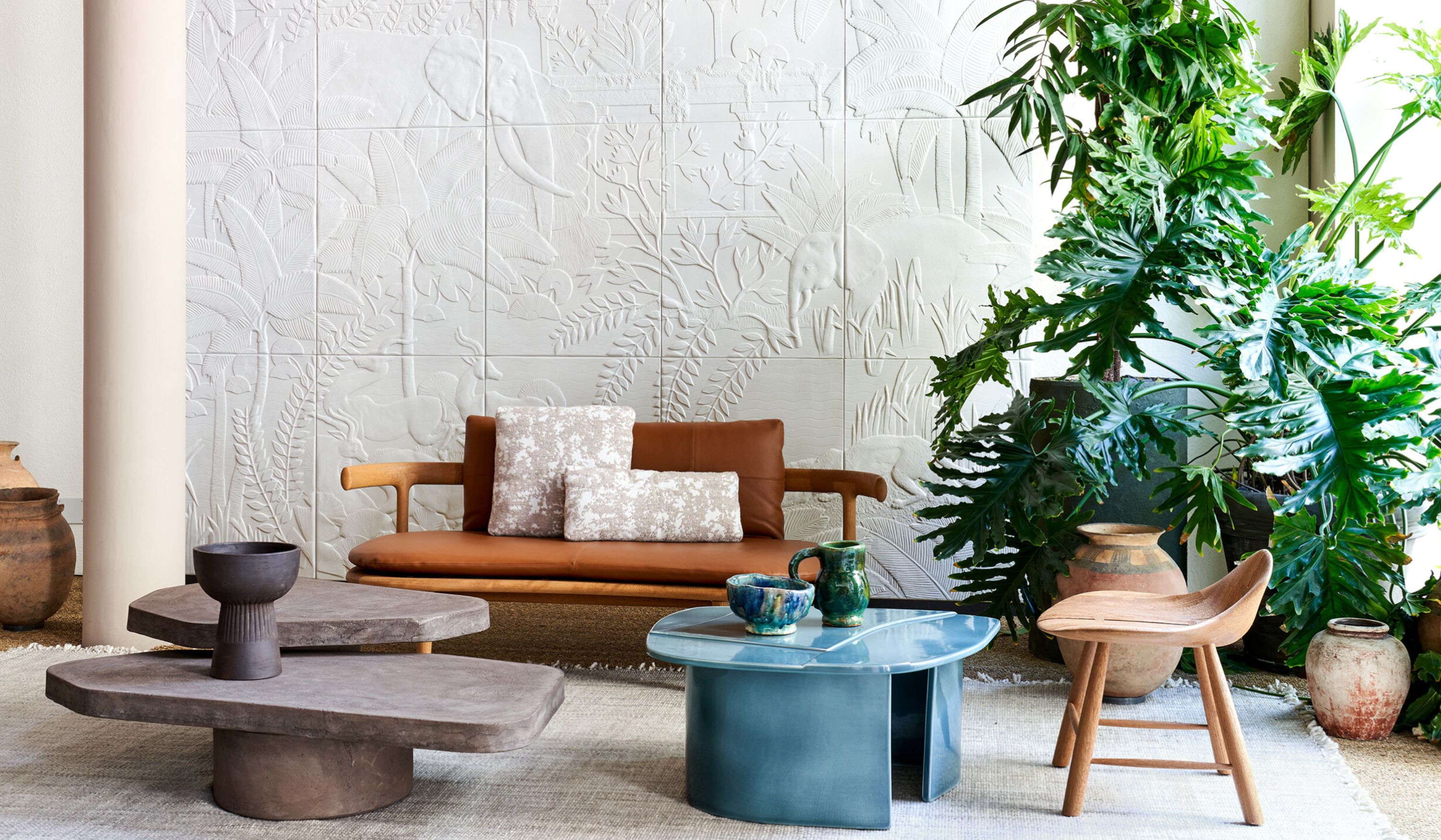
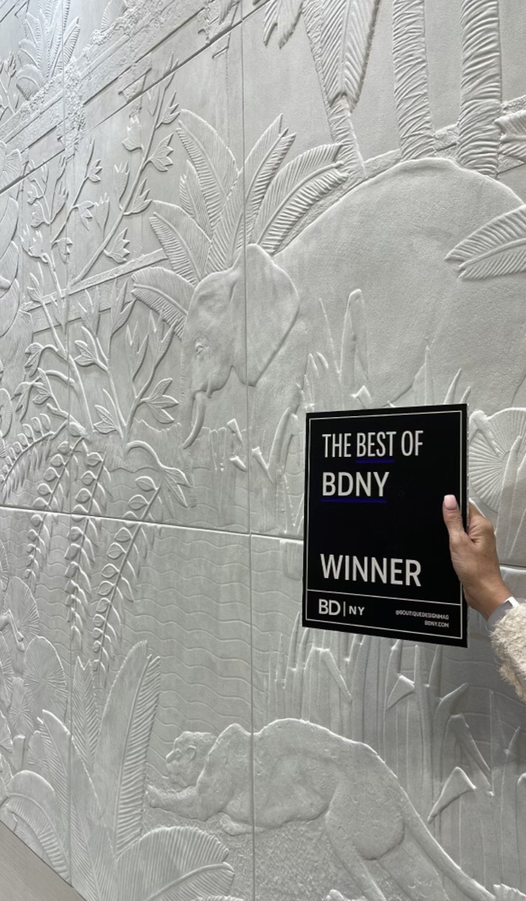
The hottest material trends continue to focus on nature and bringing natural elements into your interior space, whether it be real or manmade. Adding plants and vegetation to the interior continues to grow in new and interesting ways. Having green walls provides an architectural element to the space. We also saw furniture manufacturers building solutions into their pieces that would incorporate live or fake plant installations.
There was a lot of plant life featured within product designs from botanical fabric installations and colors to wall covering installation of large-scale murals, to more understated textures, the blending of the outdoors into the interior will continue to be a key influence in design.
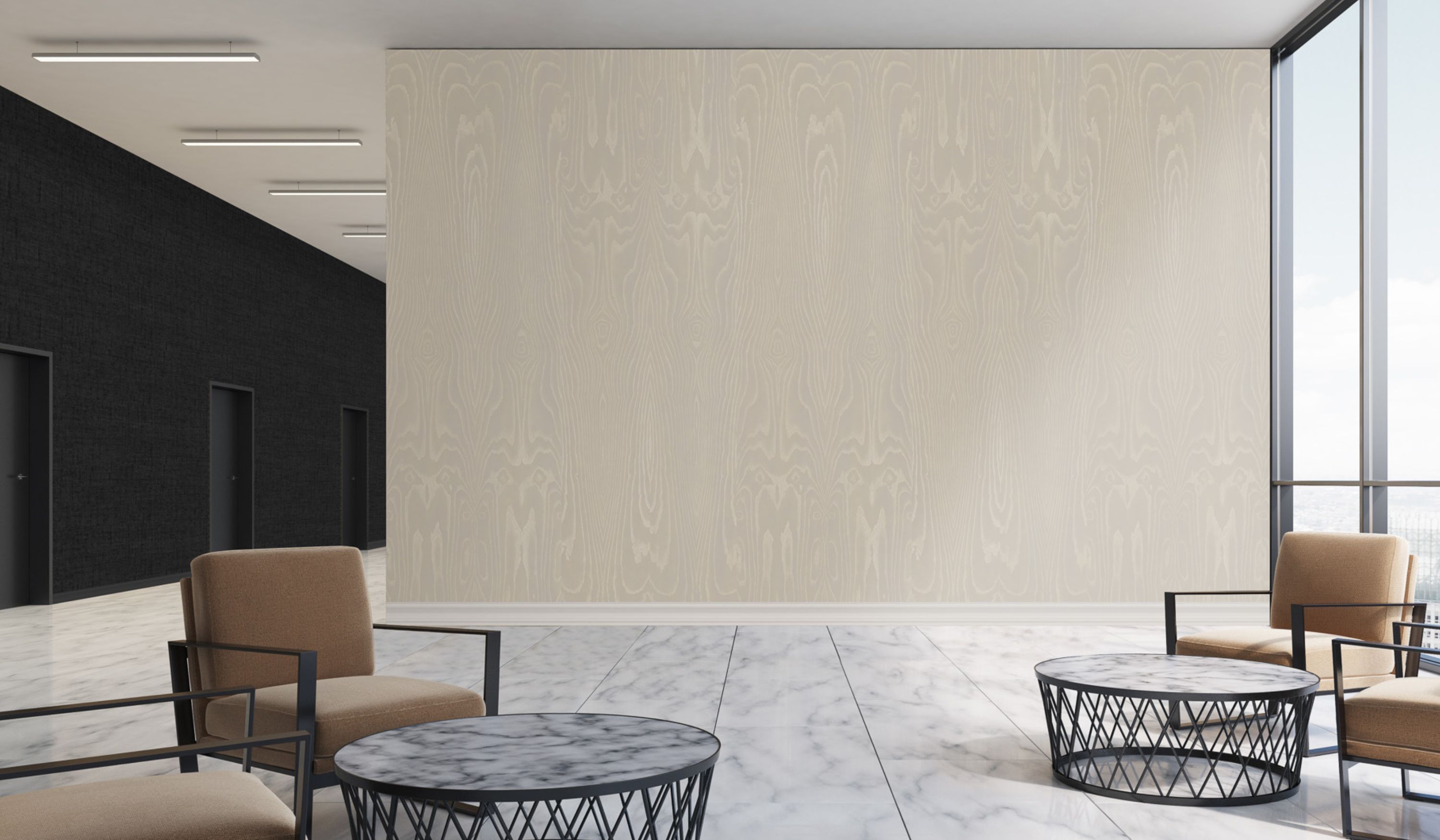
Wood looks have always been a staple in interiors. We are seeing technological advances in product design and manufacturing that are providing more authentic wood visuals on manmade products that often mimic the real thing so closely, you can barely tell by even touching the material if it is a natural wood product or manmade. Flooring and ceilings are still the largest drivers of the wood aesthetic. We are seeing wood accents on walls using wallcovering and architectural films, as well as wood veneers and millwork.
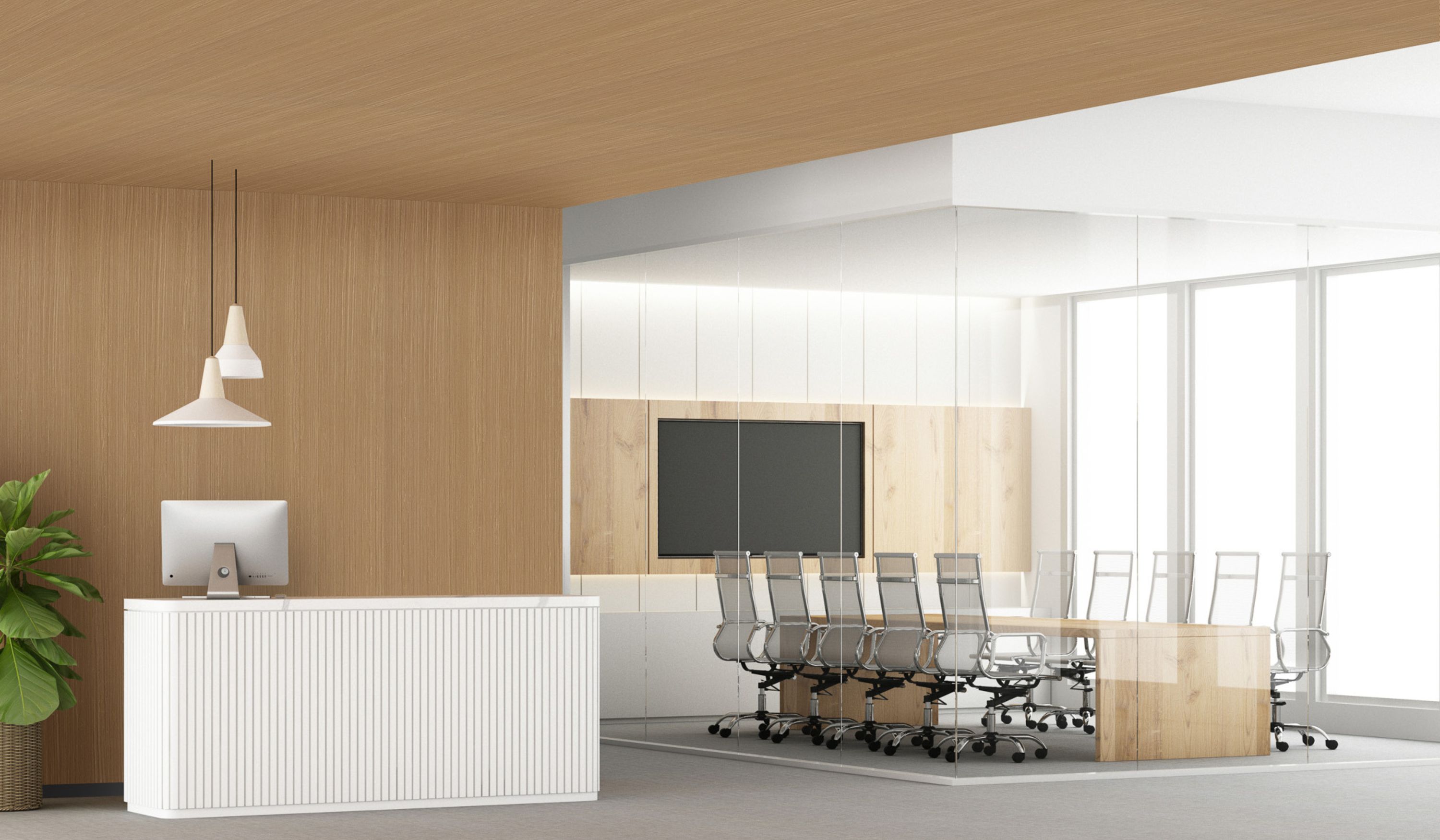
The walls feature unique product installations like herringbone and parquet looks while wood planks are being replaced with vertical reeds and slatted looks used to define rooms or as an architectural accent. Wood tones were also a key element in furniture. Wood details were used to add warmth and refinement to furniture pieces. Chairs and accent pieces feature wood and natural fibers like arrowroot, banana leaf, and jute, woven together in intricate patterns adding strength and visual interest.
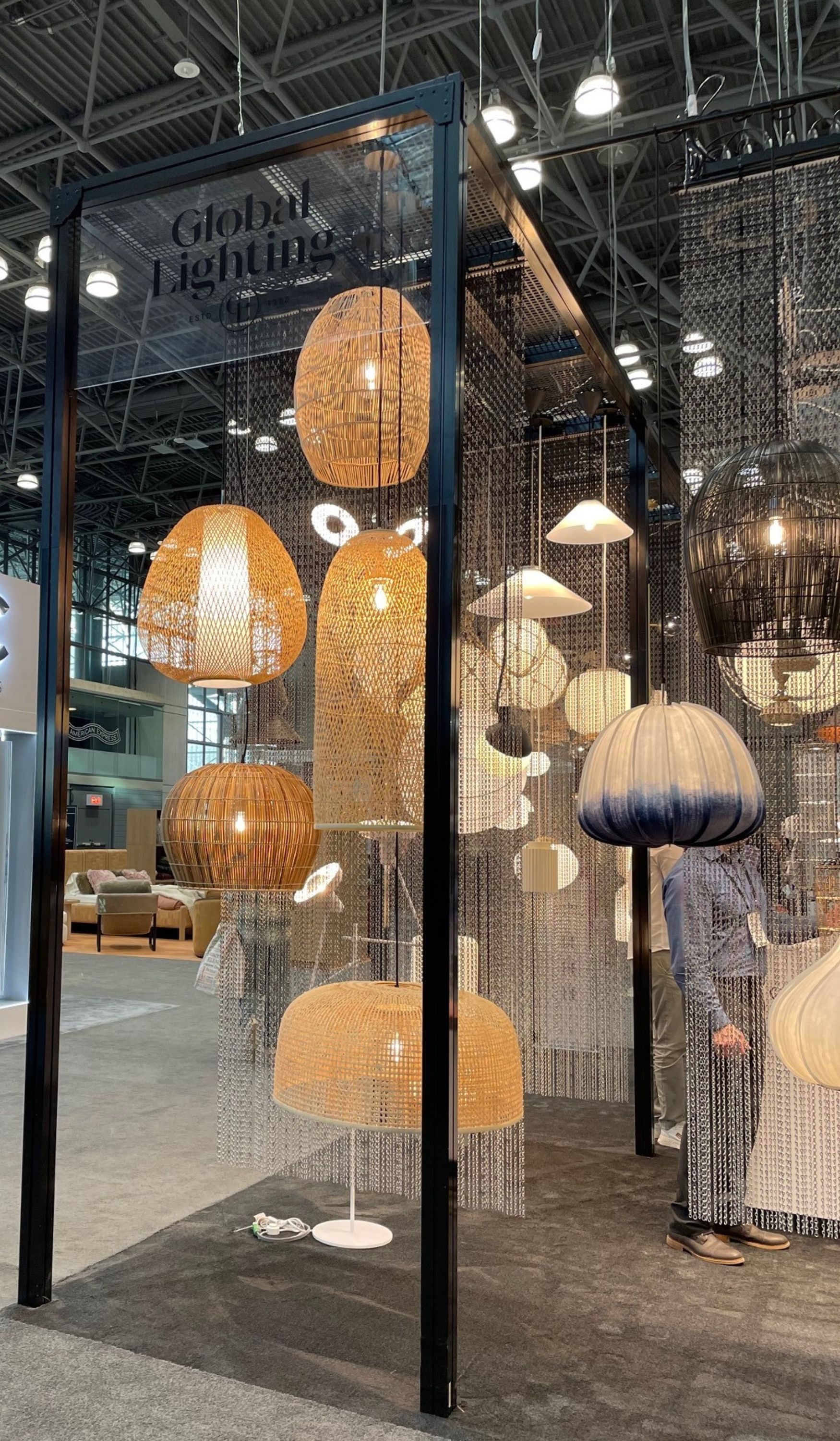
The biggest material trend was the use of texture in every element of design. Textural fabrics like chunky bouclé’s and knits added a casual aesthetic to the spaces where they were featured. Velvet fabrics made an appearance in furniture and in accent pieces while loose textured, woven and macramé looks added tactile and visual interest to all elements in the space.
In addition, our team saw the trend of soft flowing lines continuing from last year. Furniture in organic shapes with curved edges continued to gain prominence at this year’s show. Sofas and settees were void of feet and legs, giving pieces a more monolithic appearance. Metal accents were present in banding on arms, at the base, and on the top of furniture and accent pieces in warm metal tones. The circular shapes and balloon-like appearance of light fixtures and lamps was evident.
Traditional rectangular shaped accent mirrors were replaced with rounded, oval, and more freeform shapes that added softness.
FINISH
After a few years of seeing nothing but matte finishes, we were surprised to see higher sheen levels popping up in multiple product categories at the show. Wallcoverings were one of the areas where different gloss levels were most evident. From natural textures reminiscent of a high gloss venetian plaster or stone, to more matte finish woven and textile looks, the mix of gloss and matte added a unique layering element to the spaces where they were featured.
Flooring and furniture manufacturers were also getting into the mix of matte and shine within their new introductions. This trend can be a bit tricky as the higher gloss level needs to make sense on the product or surface. Shine can sometimes read as looking inexpensive or inauthentic if it is not done correctly.
Metals continued their warming trend at BDNY. The enduring presence of gold and bronze tones remained robust, enhanced by innovative finishing methods and complemented with the introduction of new materials like stones, wood, and concrete.
The warmer metallic tones varied from a lustrously polished brass to a brushed champagne bronze, incorporating subtle warmth with cool nickel undertones. We also saw matte black and the rich brown of venetian bronze present in metal finishes.
Wood finishes were more refined showing less of the rustic trend from years past. Having subtle movement with strategically placed more open cathedrals in the grain balanced out the stain colors that ranged from classic walnuts to soft whitewash tones that highlight the grain detail.
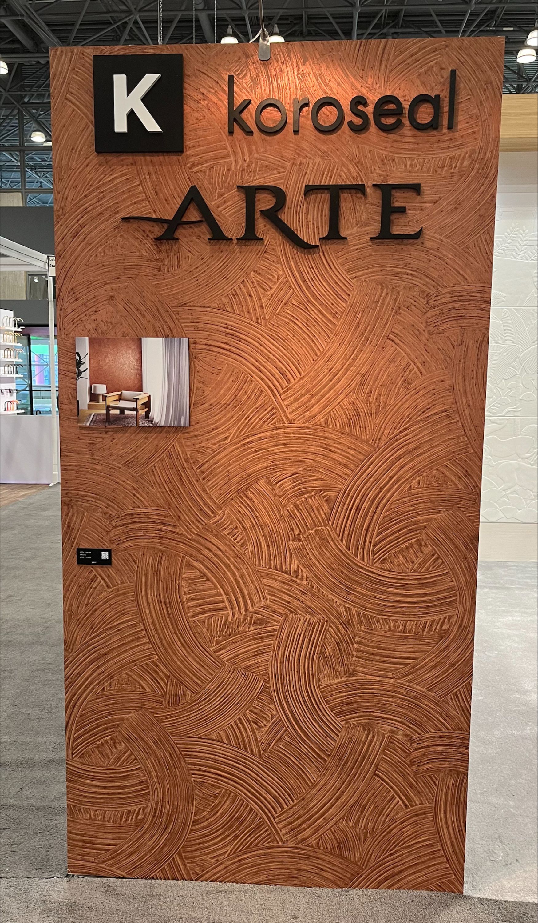
To check out all Koroseal and Arte products featured at the show as well as a highlight video, click HERE