Meet the Creator: Joe Thompson
To navigate our site, start with "products" in the main navigation and dive into any category you'd like or start with a search below.
If you need further assistance,
call 855-753-5474.
As shared in the Design Report: Inside BDNY, the Koroseal Design team was energized as they explored the showroom floor at this year’s Boutique Design New York, commonly known as BDNY. Our team is always particularly eager to see how new trending colors are used to create a statement in a space’s design story. In this article, we share some of our favorite applications of color trends from BDNY.
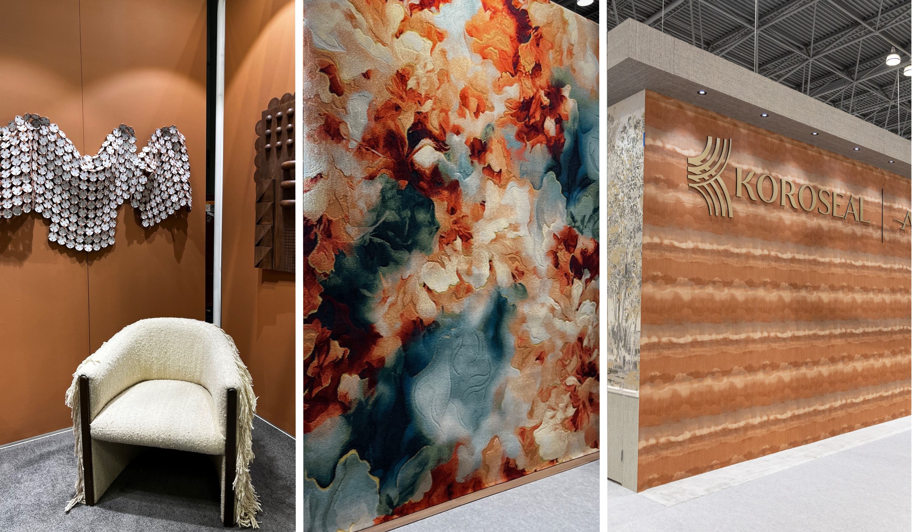
The influence of Pantone’s 2024 color of the year, Peach Fuzz, as well as hints of the recently announced 2025 Pantone color of the year, Mocha Mousse, were observed throughout the show. From fresh peachy highlights, to sandy depths of terracotta and earthy brown, these warmer tones made a statement across the show and in the Koroseal booth. Both hues displayed definitive staying power. These colors serve as a beautiful neutral base when mixed with shades of red and teal. Peachy and mocha hues were also leveraged as exquisite pops of color when paired with shades of white and dark wood.
Behr’s 2025 color of the year, Rumors, is of a beautiful plum essence, pulling in a new sense of warmth. We loved seeing the shade already contributing to masterful bath accent pieces, and serving as a ravishing undertone of dynamic tile installations.
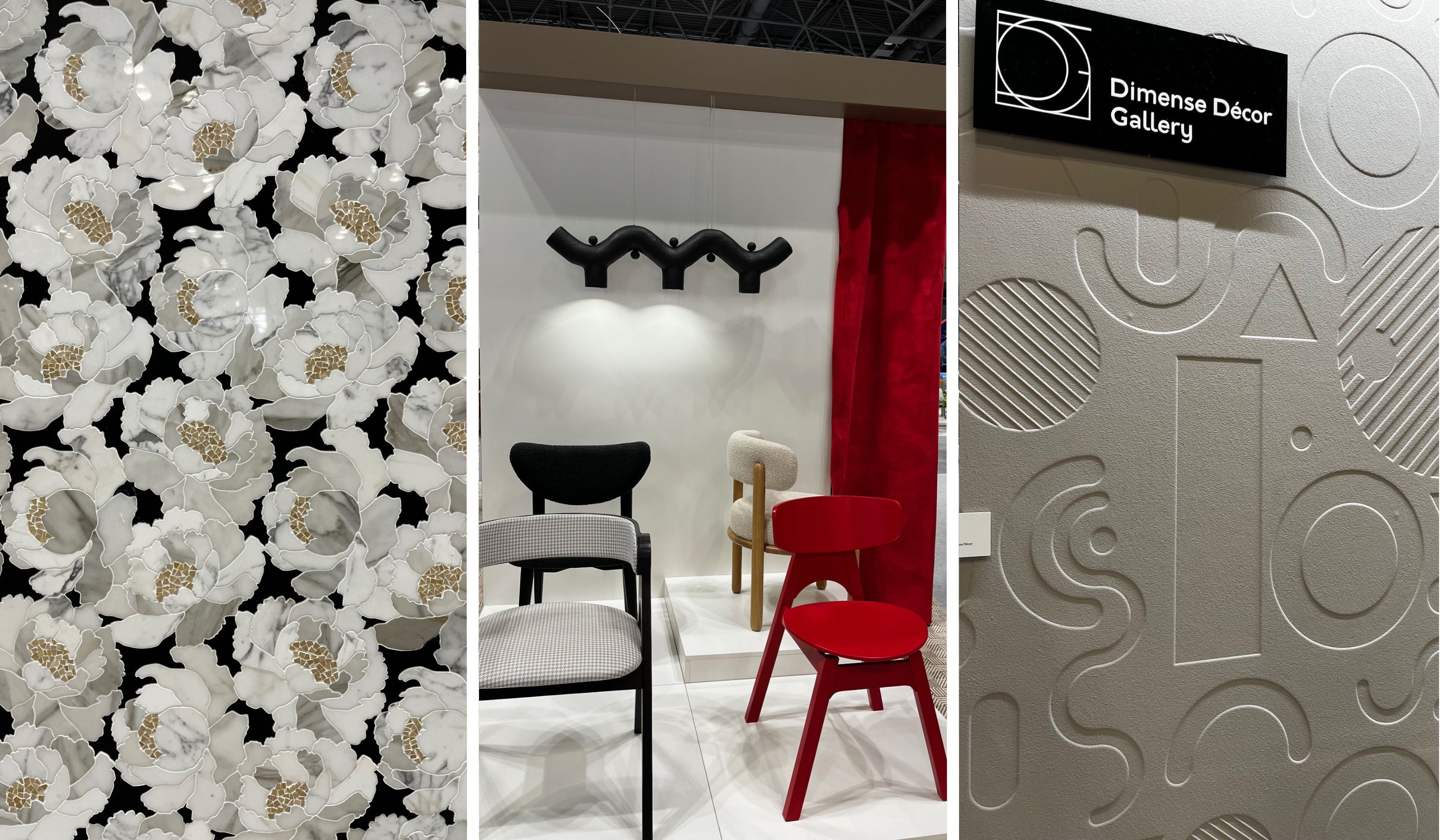
Throughout BDNY, we saw a cumulation of attracting uses of black and white. Opposites continue to attract with these two! Walls featuring white sculpted shapes, casting darker shadows provided a sense of dimension.
We also reveled in the use of white flowers on marble, floating within a contrasting black background of tile with metallic gold accents. Shades of black finishes were seen across fixtures and various furniture pieces. By toning down black in a sheen, designers were able to create a mysterious elegance with a soft silky finish to the touch.
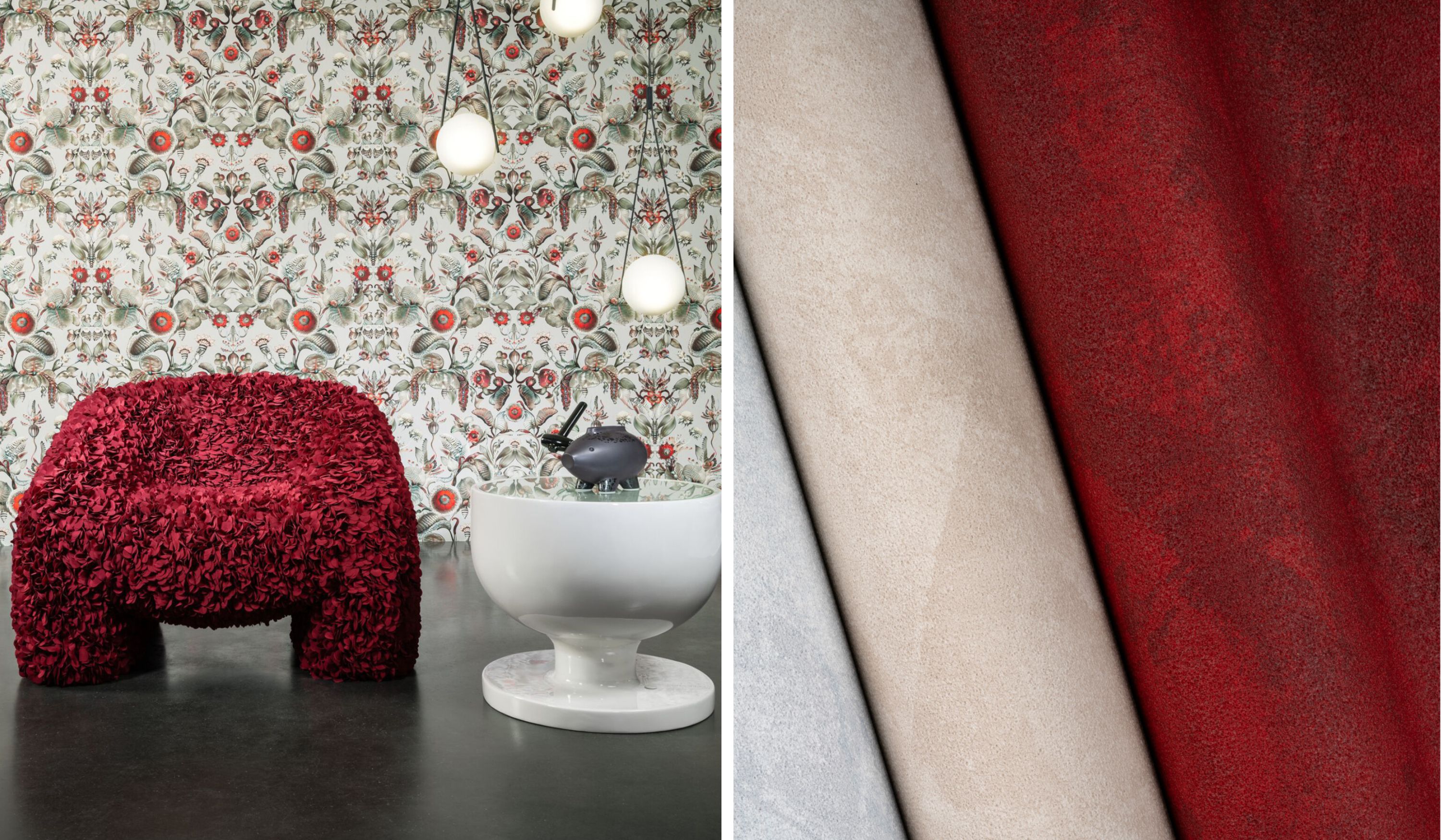
However, among the contrast of black and white, we still felt that red stole the show in this story. Arte’s new pattern, Coccinella Bella, made a stunning appearance in a vibrant red next to Koroseal’s Arid, offering a red rock venetian plaster look.
A true classic, blue offers us pastel tones, a seamless transition into the outdoors, and an innate feeling of wellness and healing. At BDNY, we loved the vibrant and uplifting hue of peacock blue, which was used in the depths of sculpted ceramic and recycled products, and provided a lovely transition to additional shades of cobalt. The combination was dazzling and invigorating. We also continue to see enchanting uses of traditional navy tones, used to renew clear saturated violet undertones. The depth of navy continues to be stunning.
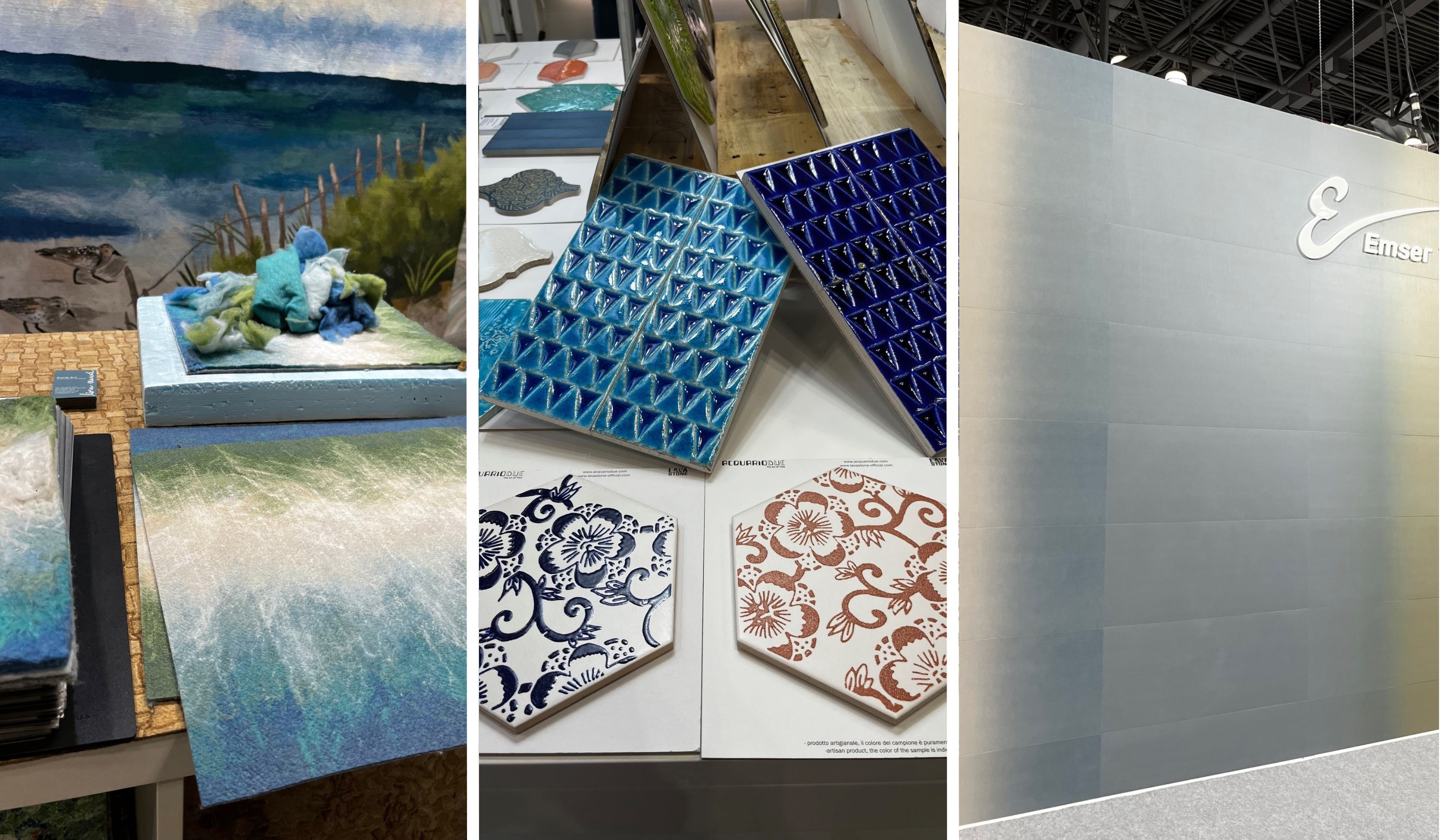
We could not leave the show without recognizing the influence of green. Greens naturally pull-in a sense of the outdoors, and provide an organic emphasis on sustainability. Throughout the show, we saw various applications of green eliciting a natural statement, whether paired with light-colored woods, or organic wovens and linens.
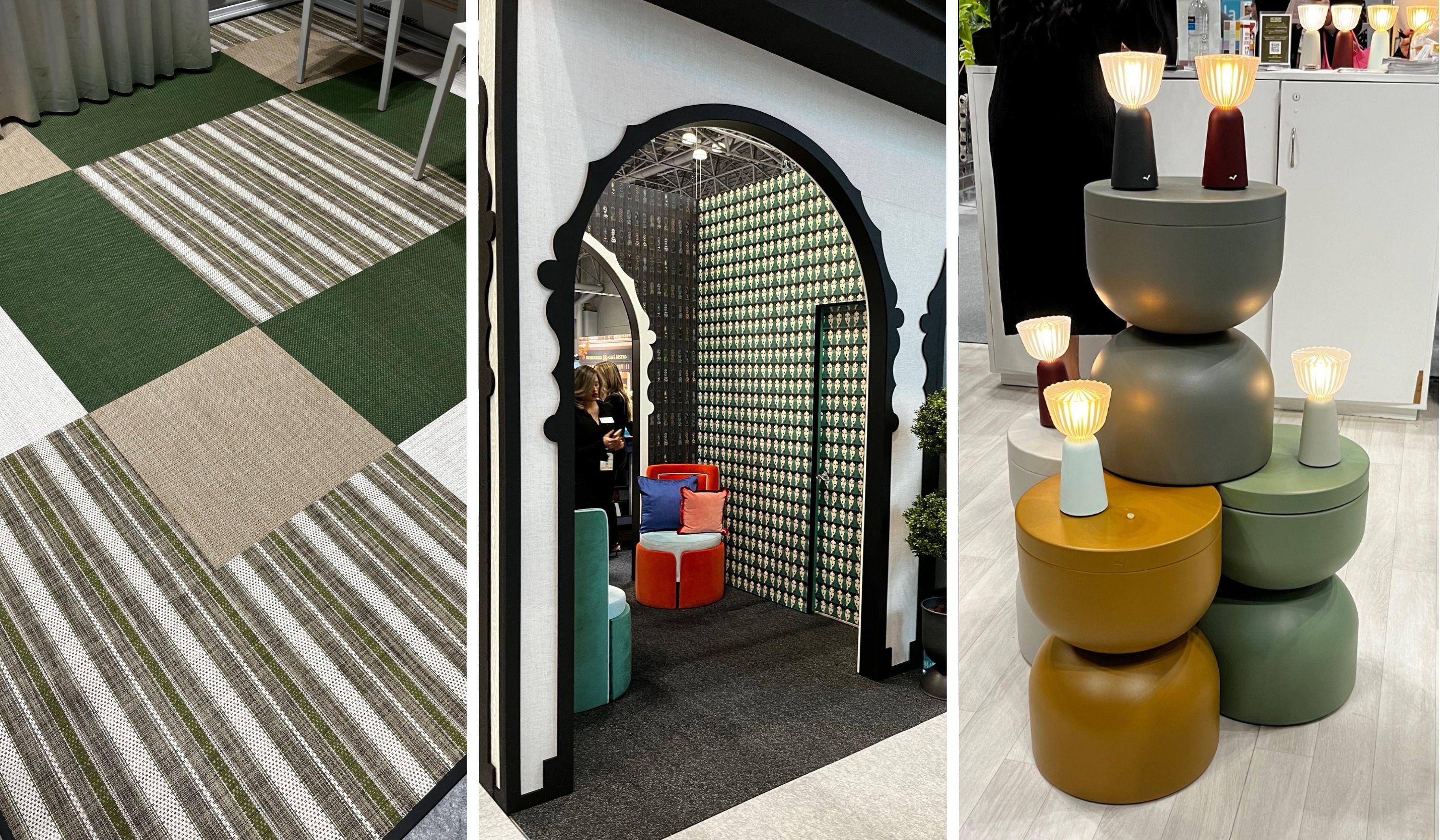
Clodagh’s new rug line with Marc Phillips displayed a modern, lovely, mid-tone green; as did other various product types throughout the show. The color green has shifted to represent all things good for us, from olives and spinach, to spending time outdoors and caring for our planet. We see it continuing to evolve in new applications for both indoor and outdoor designs.
As we reflect on BDNY, our team left with a complete sense of joy! While still grounding in the natural tones and palette directions, the colors outside of the usual neutral range were inspiring, and gave us a new energy as we look forward to future invigorating designs in 2025!
View all of the Koroseal and Arte products featured at BDNY 2024, as well as a highlight video of the show!
We've made it easier to find the products and samples you need. Start with "products" in the main navigation and dive into any category you'd like or start with a search below.
If you need further assistance, call 855-753-5474.
Pattern #: LUZ1-11
Pattern Name: Luzon
Color: Blue
Brand: Walltalkers
Designer: Patty Madden
Pattern Style: Geometric