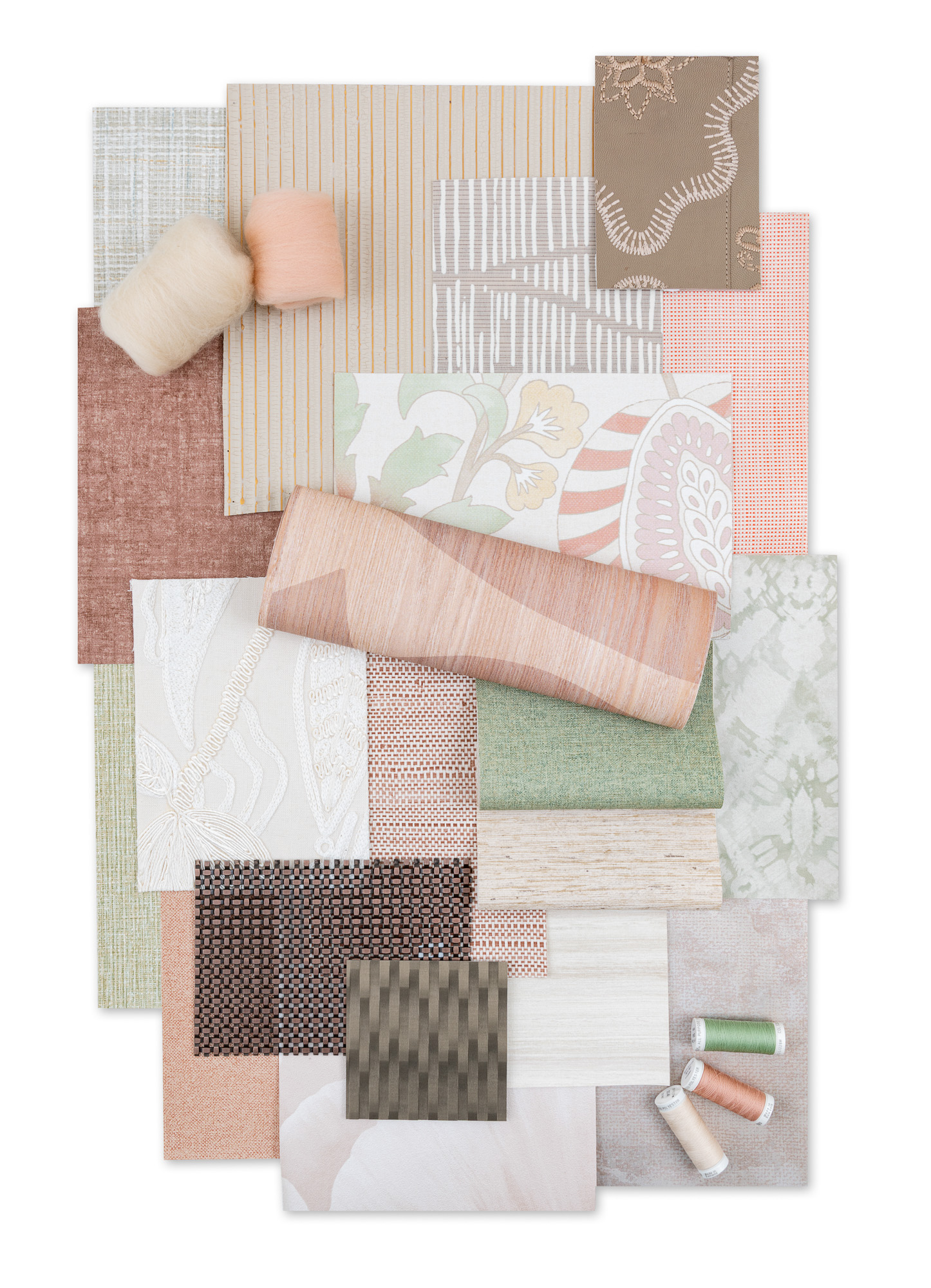
Wallcoverings
Solutions to achieve your vision - from simple & classic to engaging & innovative
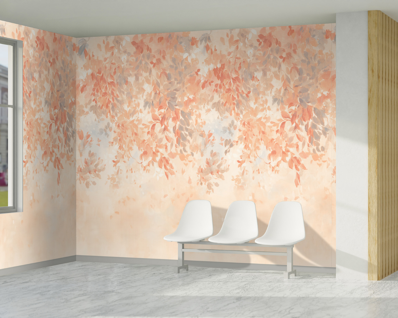
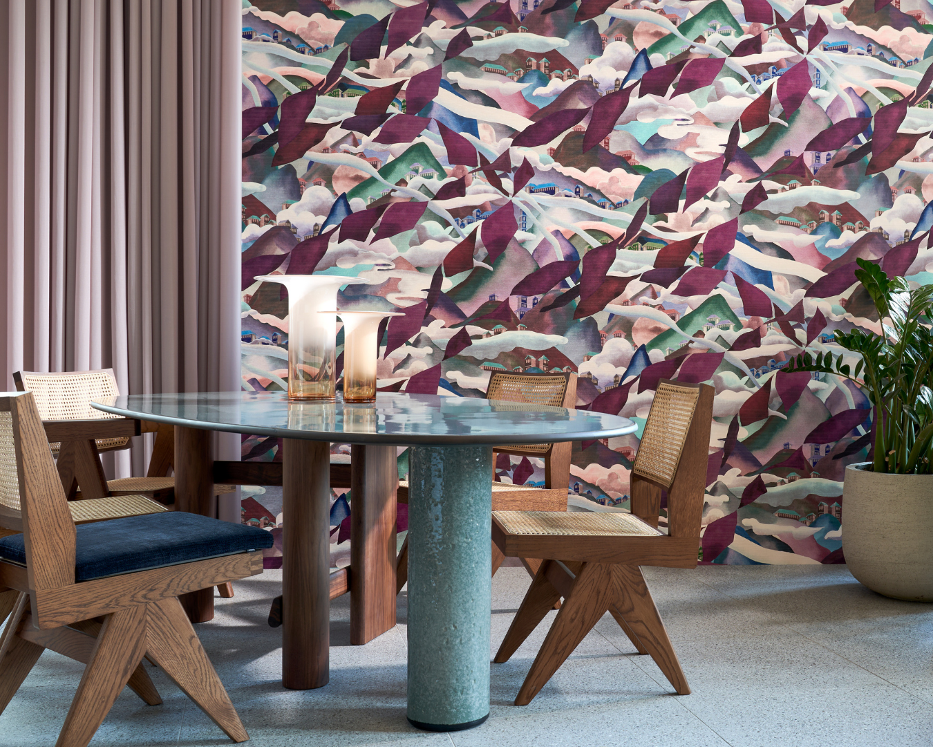
Digital
Create your own digital design, or scale & recolor an existing offering
Dry Erase & Tackable
Dry-erase & tackable surfaces for brainstorming & collaboration
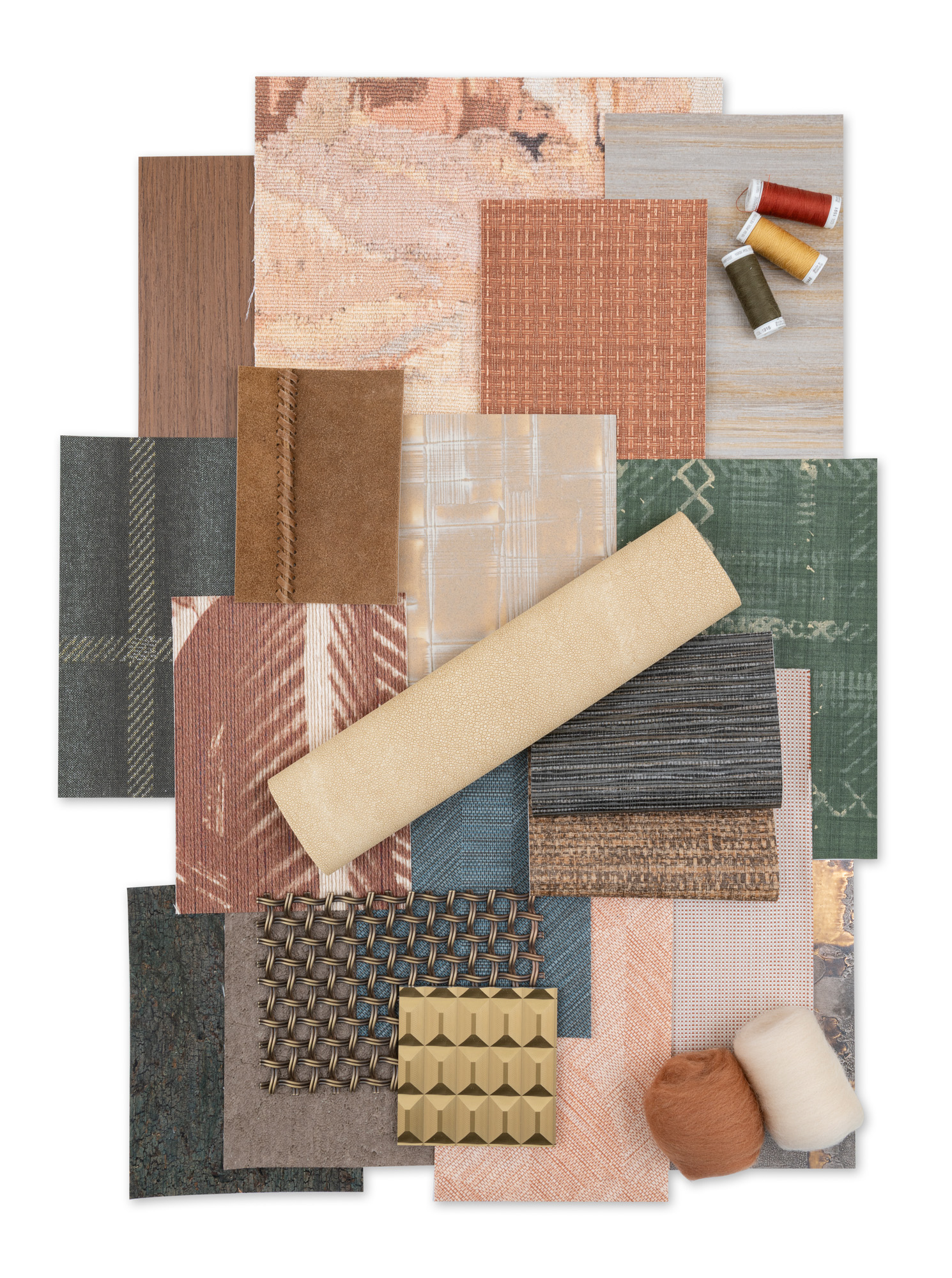
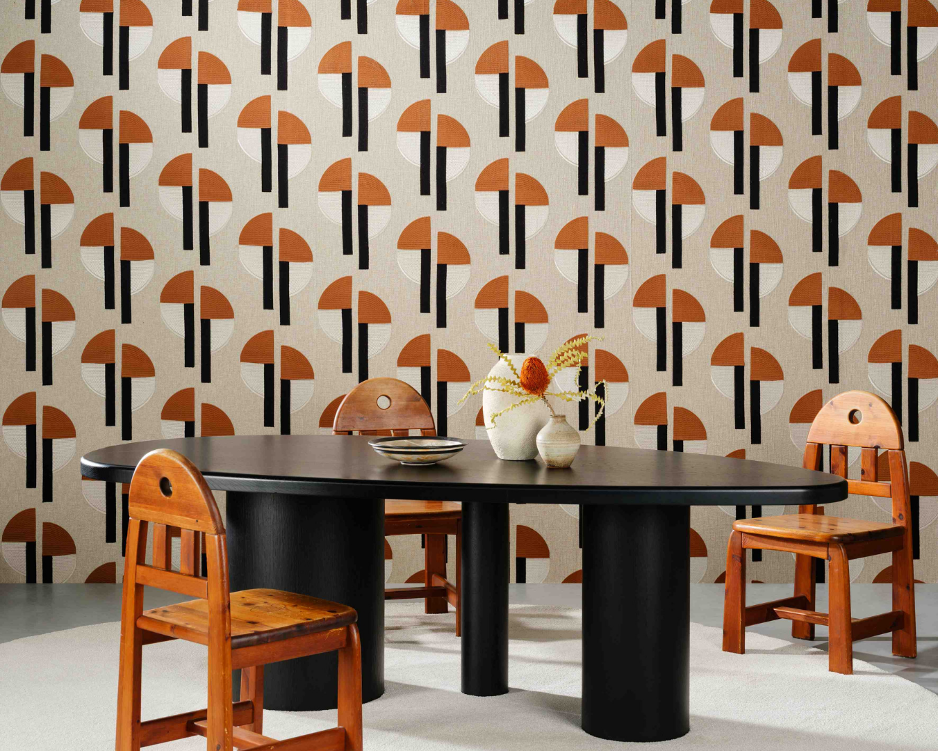
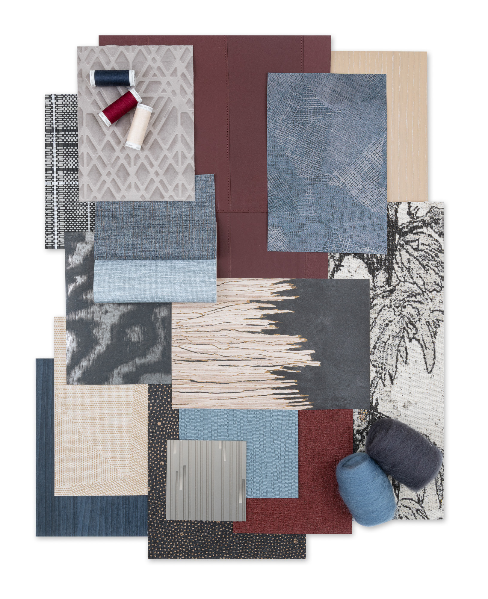
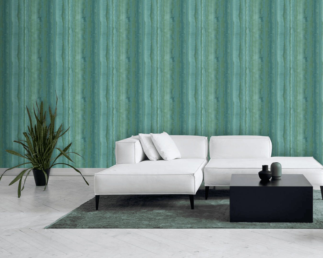
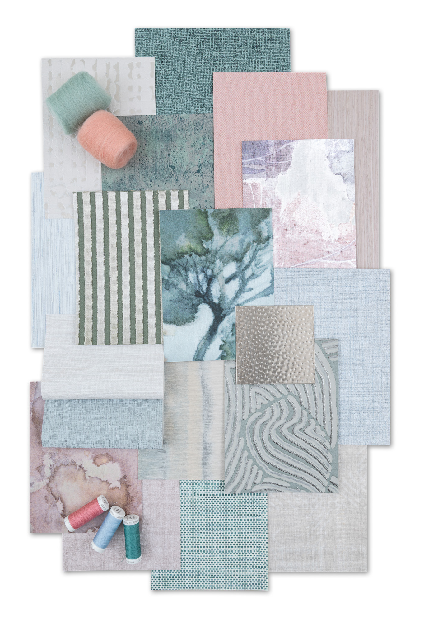
Specialty Wallcoverings
Wood, textile wallcoverings, & more
Wall Protection
Maintain the beauty and style of a space for years to come
Architectural Products
Decorative films, acoustic panels, and durable surfaces for stylish, functional interior transformations.


.png)