To navigate our site, start with "products" in the main navigation and dive into any category you'd like or start with a search below.
If you need further assistance,
call 855-753-5474.
Boutique Design New York, commonly known as BDNY, is an annual showcase of creativity and curation, inspiring the hotel design industry and beyond. Our team loves attending to network, grow, and celebrate our industry’s passion for creating. This year’s show theme was “Designed to be Remembered”, inspiring designers to look beyond visually striking designs, and to focus on the details that create the true experience of a space, as well as how those spaces ultimately make us feel.
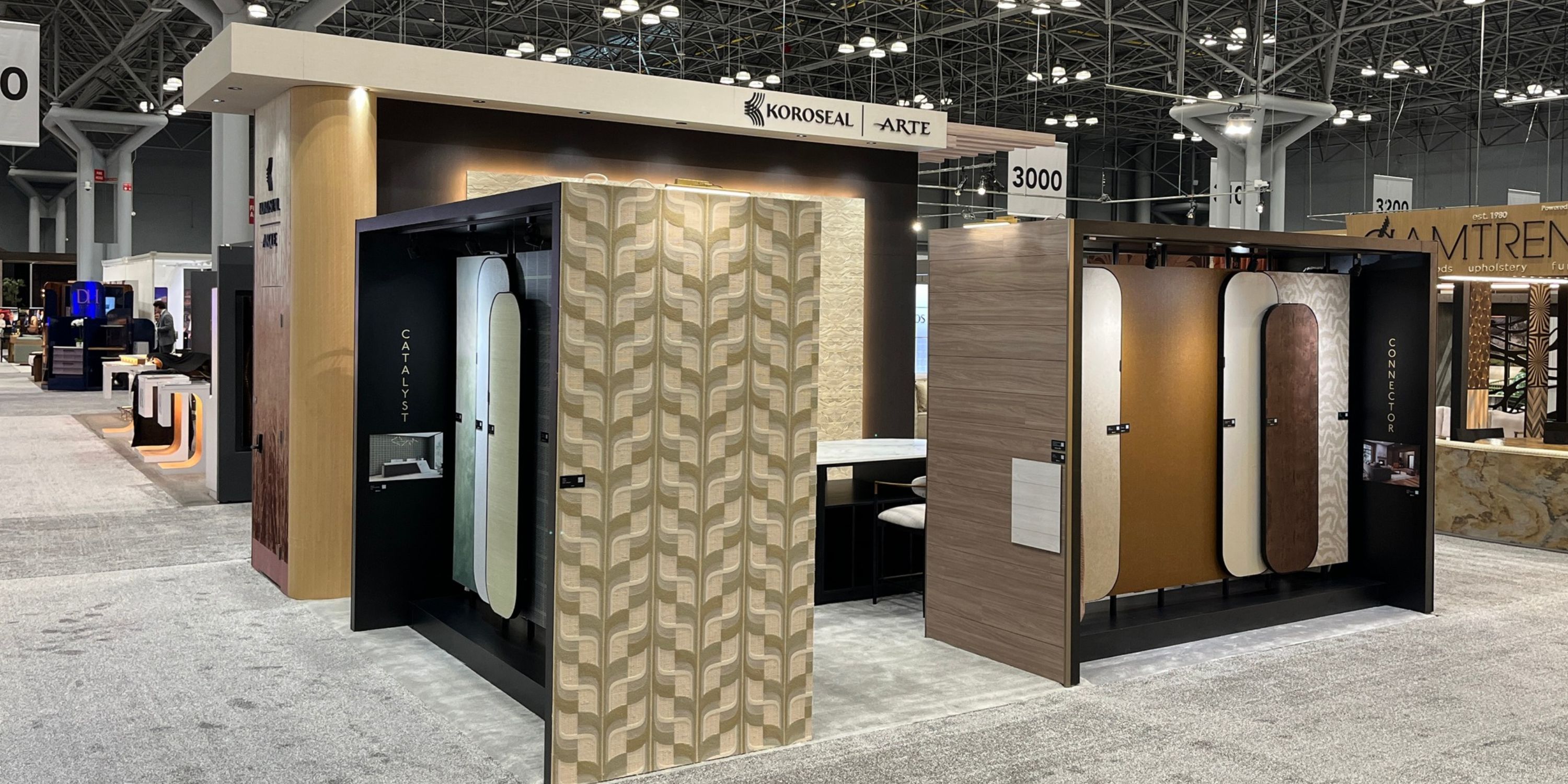
The Koroseal team not only attended the show, but was also an exhibitor for the second year in a row - allowing us to share design experiences and products with fellow industry creators. With over 100 new exhibitors, including designers and manufacturers from 55 countries, BDNY 2026 was full of energy. We were also excited to celebrate our design partner, Stacy Garcia, being named this year’s prestigious NEWH Icon of industry award winner. Congratulations, Stacy!
Learn more as our Design Team walks us through exciting highlights of the Koroseal booth and the 2026 BDNY experience!Nat
BDNY attendees include a vast array of creators who share our love for developing dynamic, meaningful spaces. Taking advantage of this prime opportunity, we leveraged our booth space to take last year’s Color Story experience a step further - exploring how one’s color story can drive the experience and feeling of a design. It was the perfect way to showcase how Koroseal products can elevate a space, support your design dreams, and fuel unmeasurable creativity. 
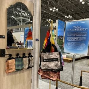
Through personalized mini sessions with a professional color analyst, Koroseal’s Finding Your Color Energy Experience allowed visitors to discover their own Color Energy, and then explore how their energy connected to inspiring Koroseal products and solutions - providing tangible examples of how to bring the identified energy to life in a space.
The experience also underscored the concept that color is only the beginning of a design. When color, pattern, texture, and material come together with intention, they do more than create a beautiful space—they create an experience.
Our team was thrilled to collaborate and consult with participants during the Find Your Color Energy Experience, and we can’t wait to see how these creators will leverage their color stories to shape future designs!
Products featured in this year’s booth aligned with four featured energies - Visionary, Strategist, Connector, and Catalyst. Each showcased energy style was supported with materials, textures, and solutions to further explore in the booth. Uncover new inspiration with some of the featured products below!
Visionary Energy
Fresh, expressive, and a little unexpected—where unique combinations create a catalyst for creativity.

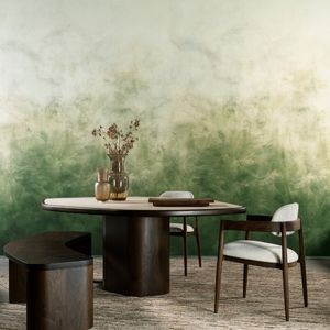
Sereno - Arte
Available in 7 colorways
Featured Color: Natural

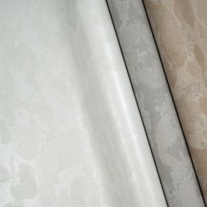
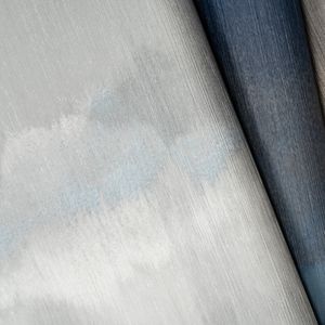
Fade - Arte
Available in 8 colorways
Featured Color: Amber

Velora Geo - Patty Madden
Available in 8 colorways
Featured Color: Oxide Dust
Connector Energy
Warm colors, natural textures, and tactile materials - where familiarity takes shape into comforting spaces.

Ostra Noir
Available in 8 colorways
Featured Color: Cigar Lounge

Aranya - Arte
Available in 3 colorways
Featured Color: Chocolate

Lunara
Available in 11 colorways
Featured Color: Edena
Catalyst Energy
Bold color, confident contrast, and purposeful materials - where design captures attention and encourages momentum.

Flux - Arte
Available in 4 colorways
Featured Color: Emerald Haze

Alara
Available in 6 colorways
Featured Color: Illume

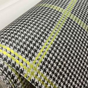
Fifth Avenue Check - SGNY
Available in 5 colorways
Featured Color: Evening Affair
Strategist Energy
Balanced color, subtle texture, and thoughtful material choices - where a quieter, intentional kind of energy takes shape.

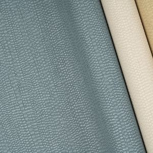
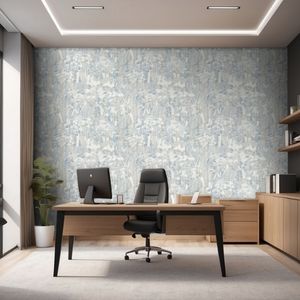
Velora Drift - Patty Madden
Available in 15 colorways
Featured Color: Quiet Depth

Charmille - Arte
Available in 6 colorways
Featured Color: Sky

Breeza
Available in 8 colorways
Featured Color: Strength
Throughout BDNY, we witnessed beautifully inspirational spaces that were crafted through meaningful partnerships and collaborations. What made these spaces transformative was the experiences they created for those walking through.
Trending Design Spaces
One Night Only drew inspiration from New York’s nightlife, telling a story of making connections.
Design: IHG Hotels & Resorts x Crème / Jun Aizaki Architecture & Design
The Gilded Dare featuring borrowed cues from Gilded Age Glamour, combined with maximalism and ornate luxury, the design team created an old-world penthouse with layers of patterns.
Design: Ennismore / Avenue ID
The Unkindness of Ravens was an immersive design space, inspired by the cooperative and social nature of ravens - debunking the old-world myth that they abandon their young. In contrast, the dark, moody living room setting served as an homage to the tight-knit community of the hospitality industry, similar to the cooperative behavior of ravens.
Design: Preen, Inc.
Dine & Design was a showcase for a new restaurant and bar design, turning the conference lounge into a cafe for meetings and conference sessions.
Design: //3877
Dimension & Details
With this year’s BDNY show focu
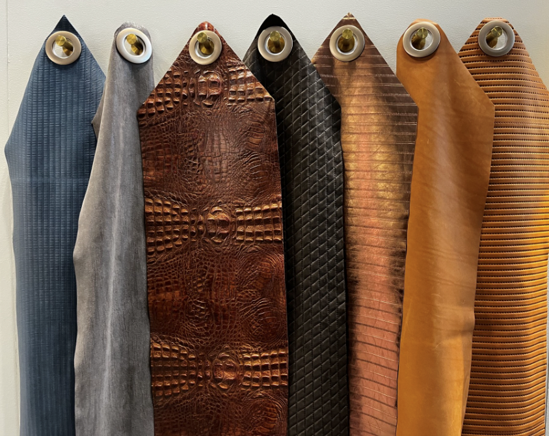
sed on the experience of a space, dimension and detail were defining elements, adding depth, texture, and movement - and driving an overall more immersive sensory experience. Rather than relying solely on color and pattern, designers are continuing to explore materials, layered surfaces, and intricate finishes to create spaces with greater character and individuality.
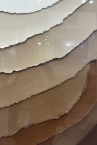
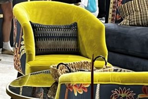
Three-dimensional materials, layered mosaics, tactile inlays, and material collages introduced depth and visual complexity, while plush fabrics, lavish fringe, and embroidered finishes (like embroidered leather) promoted more tactile interaction. Pattern-on-pattern applications like softened exotic animal prints, irregular striations, organic lines, dashes, and expressive channeling all helped to bring movement and rhythm.
New iterations of materials were equally inspiring. Metals utilized new patinas and polish, irregular glass was used to capture and illuminate lighting, and woods spanned from warm, natural tones to rich, dramatic metal finishes. Architectural influences, reminiscent of ancient ruins, emerged through fluting, plaster textures, and aged finishes while natural fibers and sustainable materials continued to surface as important elements for conscious design. 
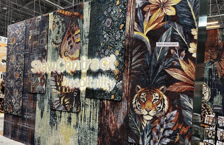
From bold tapestries and exotic motifs, to delicate nature references, details were expressive and storytelling-driven. The result - an identifiable shift toward highly personalized spaces where layered textures, unexpected material combinations, and thoughtful detailing create a distinctive feeling for the space.
Color Combinations
Throughout the show, we saw how the use of color is becoming less about individual shades, and more about the stories created through color combinations. Whether warm and earthy, soft and coastal, or rich and dramatic, layered palettes are providing greater personality and emotion, driving the atmosphere of a space.
Rich, nuanced greens, from mint and moss to olive and emerald, brought depth and connection to nature. Golden metallics, warm bronzes, ochres, and unexpected citron accents introduced warmth and luminosity. Dusty terracotta pinks and rosier hues were found emerging in a range of soft lights to deeper mid-tones, particularly across lush textiles. These added a sense of warmth and softness. Earthy browns gained
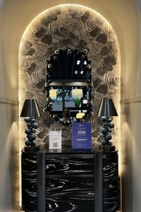
prominence, often balanced with lighter neutrals, while sandy beiges and soft blues provided a grounded, yet calming palette.
At the other end of the spectrum, saturated jewel tones like sapphire, plum, oxblood, and warm reds created more dramatic, luxurious stories when paired with brassy metallics. Layered shell and sand tones alongside coastal blues offered a softer, more relaxed interpretation of color.
Across sinks, tile and carpeting, vibrant and unexpected color combinations demonstrated a willingness to experiment, showing how color can move beyond shade to establish mood, evoke emotion, and give a space its own distinctive personality.
Explore more Koroseal and Arte products featured at BDNY 2026, as well as a highlight video of the show!
We've made it easier to find the products and samples you need. Start with "products" in the main navigation and dive into any category you'd like or start with a search below.
If you need further assistance, call 855-753-5474.
Pattern #: LUZ1-11
Pattern Name: Luzon
Color: Blue
Brand: Walltalkers
Designer: Patty Madden
Pattern Style: Geometric